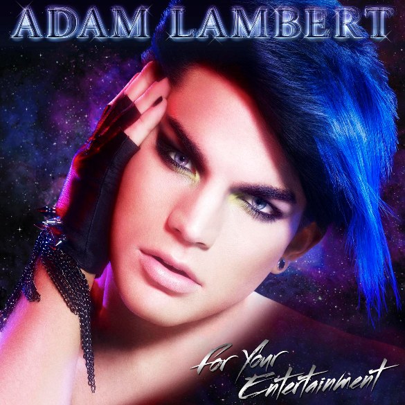
GLAMBERT: The cover artwork for Adam Lambert’s new album For Your Entertainment was released today. Who has feelings about it? Design Director of Autostraddle.com, Alex does!

Here at Autostraddle, we like to say that we enjoy the things that “[auto]straddle the line between terrible and AWESOME.” (Lexicon Sidenote: ‘AWESOME’ is always in ALL CAPS when using this phrase, and emoted in a “loud whisper of awe.” Very important.)
Let me get right to the point (I’m a designer, not a writer): Adam Lambert’s cover for his new album “For Your Entertainment” is all at once the most terrible and the absolute most AWESOME thing I’ve ever seen. I guarantee you this will be a cult classic in ten years. If this image is on a poster or t-shirt and you get your hands on it then you better SAVE THAT SHIT. I will pay you money for that t-shirt in about 15 years when it’s worn and vintage-y and I’ve lost mine to the sandy abyss of time and want to remember my youth and be cool again. Srsly.
Look into Adam Lambert’s sultry eyes and tell me you’re not confused about wanting him so bad and at the same time realizing he’s never looked gayer (and you don’t usually like dudes, let alone dudes who like dudes.) I dare you. See how he’s not wearing a shirt? Isn’t that titillating yet SO WEIRD? These aren’t bad things necessarily!
It’s our man you guys! In all his gay awesomeness. I’m proud of him. He’s not shying away from The Gay or The Glam in order for America to “get it”. America will never fucking get anything it’s supposed to as far as I’m concerned.
On that note, wanna see some really terrible/boring American Idol winner/runner-up album covers? You sure do!
(Actually the Blake Lewis one isn’t terrible as much as it’s weird. Do not want.)
I feel like the albm design is preying upon our love for the 80’s — which, just like the 80’s, is fine if the music reflects all that is promised to us in this cover artwork: glam, 80s nostalgia, Michael Jackson nostalgia (the glove!), outer fucking space! That’s a lot of promises, Mr. Lambert. Don’t let me down.
xoxo alex!
TWO DIVAS, ONE CLIP: Lady Gaga will be making an appearance in Beyonce’s new music video for Video Phone not as Fashion Gaga but as her own version of Beyonce [Gee-yonce, if you will]. ALSO. the two will be collaborating on Lady Gaga’s album. On a scale from 1 to 10, I predict that it will be AMAZING.
WHITE COLLAR: Marsha Thomason plays a gay junior agent on “White Collar”: Marsha Thomason (Las Vegas, Lost) plays Diana Lancing, a junior agent who explicitly implied on the pilot that she played for our team, though only through dialogue from other characters. You can get the pilot for free on itunes when you’re done buying Sainthood. (@afterellen)
ATTENTION WOMYN: The first round of cities for Lilith Fair 2010 were released yesterday as well as the official website for the tour. (@lilith fair)
HEATHER MATARAZZO: Heather Matarzzo wants to Give Hope to gay teens in a new PSA! (@afterellen)
GAGA: PopJustice has a track-by-track review up of Lady Gaga’s The Fame Monster and, in a word, it is wonderful. The review for Bad Romance speaks to me on so many levels [re: hats and ALL CAPS] and sounds like something I would write if I had a way with words. (@popjustice)
MEDIA CRACK: OhNoTheyDidn’t lets us know about a new documentary about celebrity obsession called “Starsuckers”. Here is the trailer (totes going to see this):
the cover reminds me of rihanna.
i don’t know why.
Maybe cause you’re totally right — look what I found: http://i36.photobucket.com/albums/e42/MFroggy/00028362.jpg
The cover reminds me a little of the three wolf moon tshirt.
You’re not alone.
http://www.bestweekever.tv/2009-10-27/bwe-tv-presents-three-lambert-moon/
That is amazing.
oh my goodness, i love it! hahaha
I’ll certainly agree on the AWESOME part. I Effing LOVE this cover and the fact that Adam…and 19 went for it full tilt. It’s a total bitch slap to all those who’d like to keep him in a box. He’s a chameleon, and that’s just one of the many reasons he’s so ridiculously exciting to watch.
That looks like an interesting documentary – it seems to have a Michael Moore vibe to it. Funny thing is, I actually looked up “Starstruck” from the lede instead of “Starsuckers”. I guess Lady Gaga was on your mind?
Gaga is always on my mind, Foist :) Thanks for the heads up — its fixed!
actually Intern Lex did it, which means Lady Gaga is on HER mind, which means our work here is done, the children are ready to graduate into the meadow.
Hey – I’m American and I fucking love this guy and this AWESOME album cover. He got me from “hello,” darlin’.
i definitely want to wear the greatest hat in the most amazing restaurant.
i also want to buy the deluxe Fame Monster so I can get a lock of Gaga’s hair.
…..wait no….i don’t want that at all.
I agree with AWESOME but not terrible! He looks gorgeous! haha i like how you said the other covers were boring. and blake’s is weird!
Pingback: Adam Lambert’s ‘For Your Entertainment’ Album Cover | US Post Today.
I love it. It’s more or less what I wanted and expected from Mr Chameleon. While I love the almost au naturel Adam, as he appeared at last night’s This Is It premiere, this picture is appropriate for the purpose, as is his appearance on the Time for Miracles (now if he had wandered up the road looking like as the world is crumbling around him and people are running for their lives, I would have worried!).
This says Lord Gaga, this says Bowie, Bolan as well as the best of the 80s. This says there is no other male artist like this today.
This cover is not going to go unnoticed on a shelf or rack full of other albums. The people who already know Adam and don’t like him/his music were not going to buy it anyway. The people who don’t know him will be intrigued and whether for right or wrong are more likely to give the album a listen.
Um, I hope you know I will now only be able to refer to him as Lord Gaga. You are awesome.
Dude, he looks like a hot lesbian! Is that even legal?? Gay boys, do not deceive me with your lesbian haircuts and cunning use of eyeliner! Tis unkind!
Sorry, but it’s not awesome; it’s terrible. As an Adam fan, I’m really disappointed–he looks like a girl. I’m still buying his album though.
Are “looks like a girl” and “AWESOME” mutually exclusive? anyhoooo actually only half of his face looks like a girl, it’s split down the middle on a diagonal. But i shouldn’t even say that, ’cause what does “like a girl” even MEAN in this day and age?
We like things that “look like girls” around hurr.
Alex, I think I love you. Almost as much as I love Lambert’s album cover (which is a whole lot). You get it. Welcome to the crazy ride.
I love that there are not one, not two, but three different tweets from Autostraddle saying how TERRIBLE and AWESOME the Lambert cover is. I LOVE YOU ALL SO MUCH.
After seeing his video last week, I thought for sure he was toning down the glam, but NOT SO!!! It’s so AWESOME (loud whisper of awe) that he is being himself. A;ex, if you want, you can call yourself a designer that is also a funny writer.
Thanks Heather! I’ll add funny writer to my resume!
America may not get Adam’s album cover, but you do.
This cover tells me that 19E is standing behind him 100%. Adam gets to be as creative and crazy as he wants. Can’t wait to see what he’ll do next.
when i first saw this cover yesterday, i burst into laughter and nearly dropped my laptop. it. is. AWESOME. seriously! i cannot imagine a more ‘glambert’ image, and i’m so excited that 19 entertainment let him be himself, even when he looks like the most gorgeous woman i’ve ever seen. i hope it’s a sign of an amazing album to come!
I can’t decide what part I like best about that cover:
-The head tilt.
-The frosted and so slightly pink lips.
-His pretty, pretty eyes and pretty eyeshadow.
-Or outer-fucking space.
I’m pretty sure the head tilt, lips, and eyes would be nothing if his dismembered head/some shoulder wasn’t floating in outer space. It totally seals the deal here. Adam wants you to know that he’s not afraid of the deadly vacuum of space. Much like water bears.
[Are you reading this Emily Choo? I HAVE A THEORY!]
Okay, we’re putting Adam Lambert and “Lord Gaga” in our cartoon. GO!
i think the fact that it looks like a yearbook picture and a pageant girl had sex and this was the product is also a highlight.
it looks like he’s wearing an invisibility toga! one, please.
omg I love this from bestweekever.tv, and I thought I’d share:
“Unicorns may not exist, but gay ones certainly do, and this album cover is more of a warning to that endangered species: Step your game up, you cashmere soft, ivory horned, glittery hooved motherf**kers. Cause Lambert’s through f*ckin’ around, y’all. Thank you, you beautiful Lambert, you. You have not let us down.”
–
I love it.
–
http://www.bestweekever.tv/2009-10-27/adam-lambert-has-a-message-step-up-your-game-fancy-unicorns/
I LOVE EVERYTHING ABOUT THIS ALL CAPS EXCLAMATION POINT.
I am just super excited for the Lilith Fair. I was 8 when I went to the first one, and woefully oblivious to the mecca of gay that surrounded me. I want a do-over!
Picture reminds me of Azis, Romanian pop icon. Youtube him post haste. You will thank me later.
I’m a senior art director, so I main concern myself with designing for sales. So far, I’m not in tune with the cover, and he may have lost some of his cross-over market to his cross-dressing market.
But then I remind myself, this IS Adam Lambert. And, with this much talent behind the songwriting and Adam’s ability to inject his own style into the songs, the CD actually should be RED HOT.
There’s alotta hype behind this guy because he has one of the biggest fan followings ever from Idol. So, the expectations are high. I’m gonna say, “Lets not judge a CD by its cover” and wait and see if he delivers the goods.
It’s not the androgyny that’s offensive. Bowie’s album covers were stunning.
It’s the freaking terrible execution.
The font, the colors, the airburshing looks like it was designed then drawn by a 4th grader. So CHEAP and hilarious.
Why didn’t his management, friends, family…advice him? And how did they hold themselves from laughing??
I love Adam but there’s no way I’m walking into a shop and buying THAT lmao.
You can do OTT and camp WITHOUT looking TACKY. If they actually think this won’t damage sales BIGTIME, they’re lacking common sense.
You only have to look on Twitter and blogs to see how many fans have said they wouldn’t be seen caught dead with that cover.
Perhaps this “cheap and hilarious” execution was done on purpose. Which I think it was.
–
“How did they hold themselves from laughing??” Actually, on the Seacrest show this morning Adam was saying how he showed his friends the cover and they’re reaction was “Oh my god, no you didnt!”
They know. They get it.
He even said it directly: “I wanted people to look at it and laugh.”
It’s not that serious, you know?
Adam is awesomeeeeeeeeeee, i love him to bits. I heard there’s another album cover though, where it’s all black and white and they show his eyes and fingers.